|
ILLUSTRATION &
ADVERTISING
Advocacy Poster
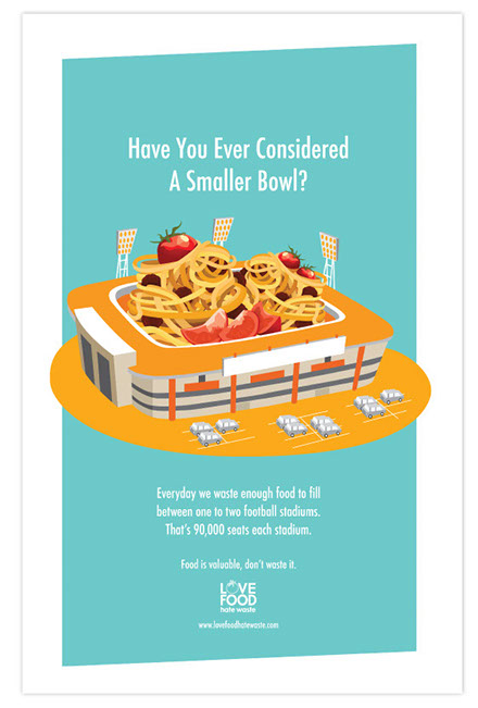
This poster was designed to help demonstrate how much food people waste on a daily basis.
In order to get this message across I chose a clever literal approach by filling a football stadium with spaghetti. I chose spaghetti because I find that no matter where you are, be it a restaurant or having a simple home cooked meal, pasta is something many people waste because it is so filling. If you think about football one of the most well know games is the Superbowl. It is clever because the spaghetti is served in a bowl and the caption above to catch the viewers attention is “Have you ever considered using a smaller bowl?”.
Program: Adobe Illustrator
Typeface: Futura (Condensed Medium)
Menu Redesign
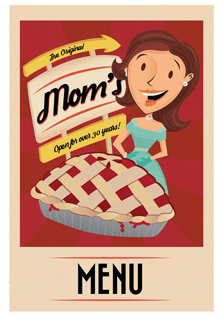
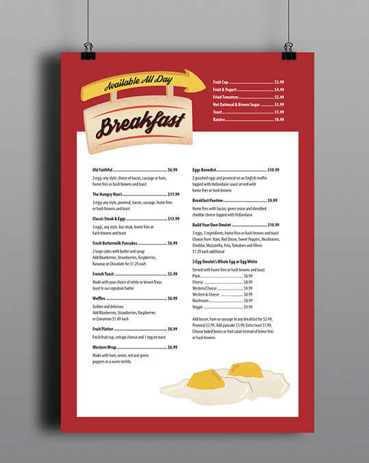
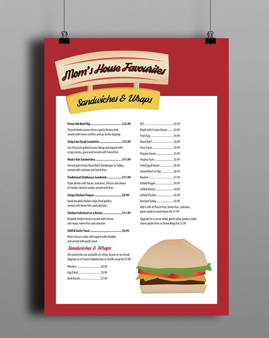
A menu cover and food item spread redesign for The Original Mom’s restaurant.
I decided to showcase the restaurants retro look by incorporating it these designs. For the menu cover I drew and then illustrated a sign, a mom and an apple pie. I chose to illustrate the sign because on the side of the road Mom’s already has a sign that looks like this and I believe this is what makes them stand out. I chose to draw a mom because of the family style they offer. Families with young kids often come in and this helps to promote the home cooked family meal effect. Pies are a huge part of the restaurant. The owner bakes her own pies and places them on display to purchase.
Programs: Adobe Illustrator, Adobe Photoshop, Adobe InDesign
Typefaces: Myriad Pro, Bazar, Streetwear
Canadian Living Advertisements
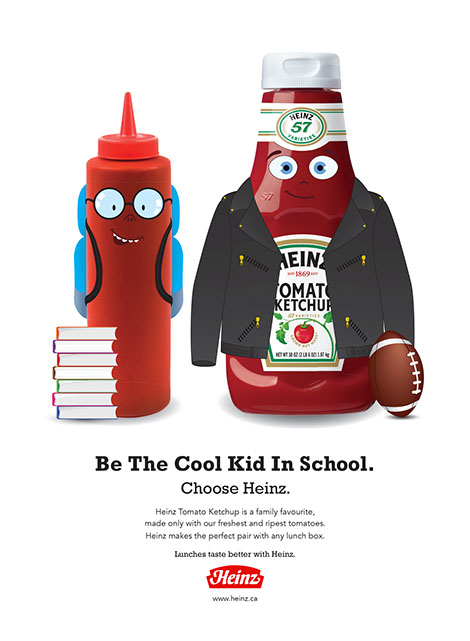
A series of Heinz advertisements designed for Canadian Living Magazine.
Ad One: My goal was to promote that Heinz is better than regular ketchup and I did this by creating a cartoon image. I chose a small skinny ketchup bottle to be my “nerd” and a larger Heinz bottle to be my “Cool Kid” or “Jock”. The nerd is shown wearing a backpack and glasses with books, while the cool kid is shown wearing sunglasses and a leather jacket carrying a football.
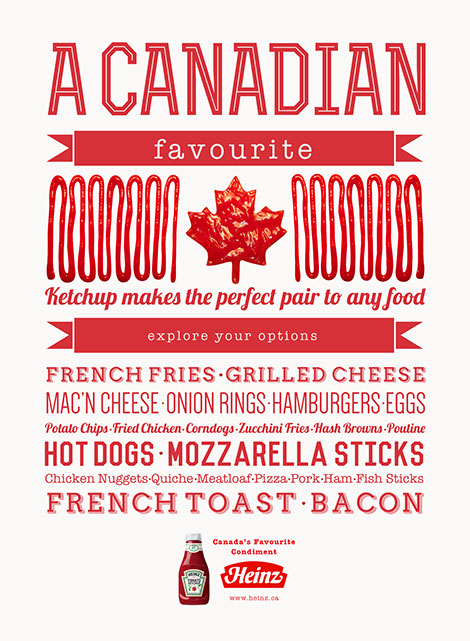
Ad Two: I went with a Canadian theme promoting how Canadians love ketchup. I also wanted to switch it up and have a more text based advertisement. Instead of telling customers what Heinz is made of, I went with what you can put it on and listed some examples. I also wanted to show how ketchup is fun to play with and show the product, so I actually created the image of my Canadian flag using ketchup.
Programs: Adobe Illustrator, Adobe Photoshop, Adobe InDesign
Typefaces: Rex Bold Inline, American Typewriter, Airbag Regular, Lobster, Dense, Vincent, Avenir
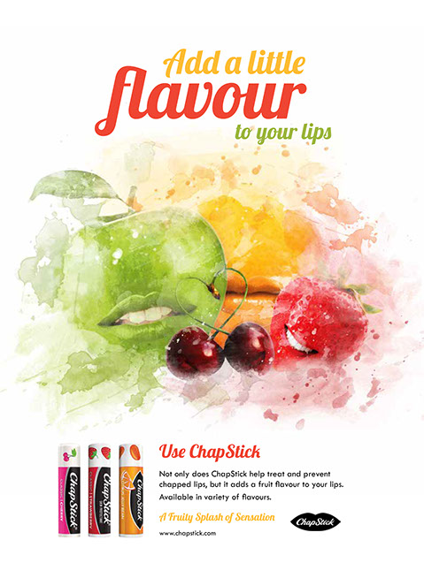

A series of ChapStick advertisements designed for Canadian Living Magazine.
Ad One: I wanted to promote how ChapStick has fruity flavours. By placing lips on the fruit, it shows how your lips can taste just like these fruits.
Ad Two: I chose to use a mermaid because they are elegant, live in the water and connect with females. This ad is directed to more of a female audience since most Canadian Living readers are female. I picture mermaids as the perfect woman. They always have perfect features, such as hair and lips, so I thought a mermaid would be a good way to advertise hydration ChapStick.
Programs: Adobe Illustrator, Adobe Photoshop, Adobe InDesign
Typefaces: Tw Cen MT, Lobster, Myanmar MN, Effloresce,
Walker on the Moon
The Hunger Games - Information Graphic
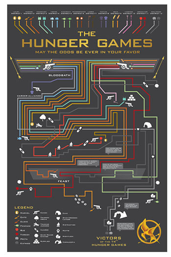
An information graphic demonstrating the first Hunger Games movie.
In order to demonstrate the Capital's power and control, I created the movie info graphic to symbolize a circuit board. In this case, the circuit board is the Capital and each wire component represents a tribute from each District. Similar to a circuit board, lines end and cross over at different points. Some lines of power from the Capital end and only get so far before their energy is cut off because of their death. Symbols are a huge part of The Hunger Games movie, so I maintained this theme and used symbols to represent words or actions.
Programs: Adobe Illustrator, Adobe InDesign
Typeface: BankGothic Md BT Medium
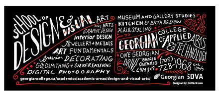
SDVA Poster and Card
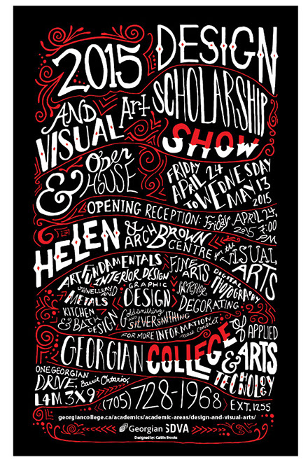
A poster & card design for the School of Design and Visual Art Scholarship Show.
The SDVA poster and card will be seen by college students and high school students. I wanted my poster to target this audience so I created a poster that would draw people in. I chose to use the colour black for the background because it allows the white text to pop off the page. Red is normally a colour that stands out so I chose to use this as my accent colour for the smaller details. I got my inspiration from “Small Talk” wine labels.
Programs: Adobe Photoshop, Adobe InDesign
Typeface: Hand Rendered

